ABOUT ME
WORKS
Ctrl+Alt+Fr33dom
A Sun-Dried Time Capsule
Suara Tukang Tua
Kelindan
Lasalle DCE Reader
Pasang Surut
Archifest
Diriku
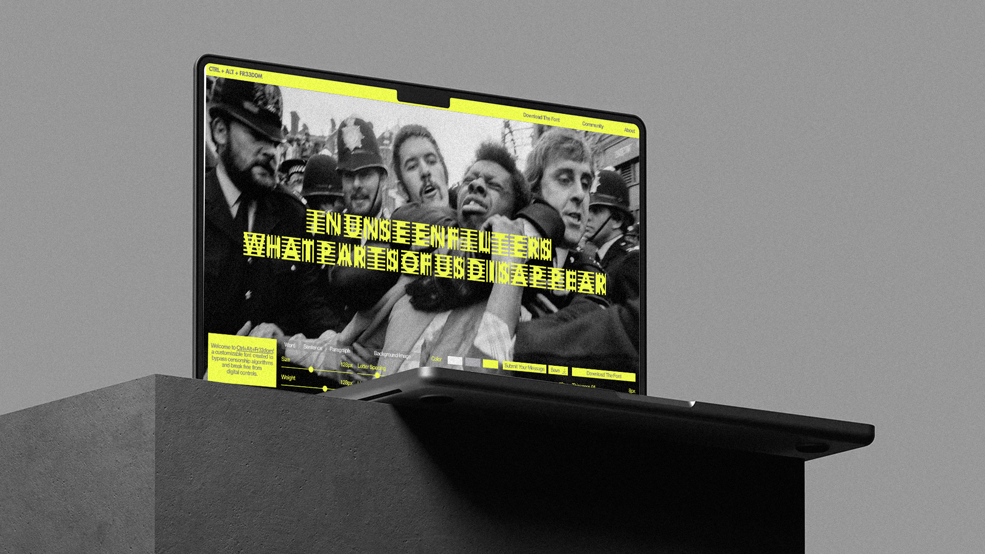
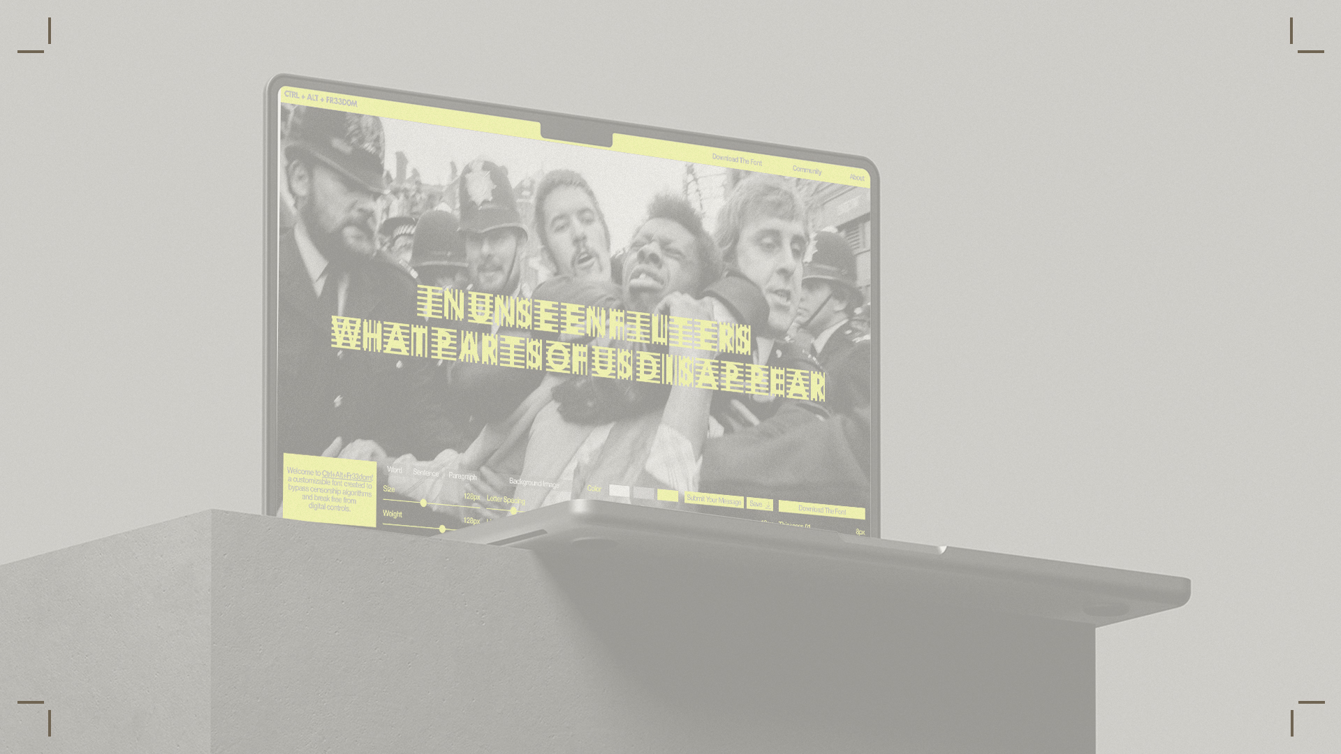
CTRL+ALT+FR33DOMtype design / brand identity
D&AD New Blood Award with groupmates Danh Nguyen, Hui Ting Quek, Nguyet Minh Hoang, Sulaiman Baktiyar

A SUN-DRIED TIME CAPSULEimage making / exhibition
Presented by Objectifs Film and Photography Centre as part of Singapore Night Festival 2025
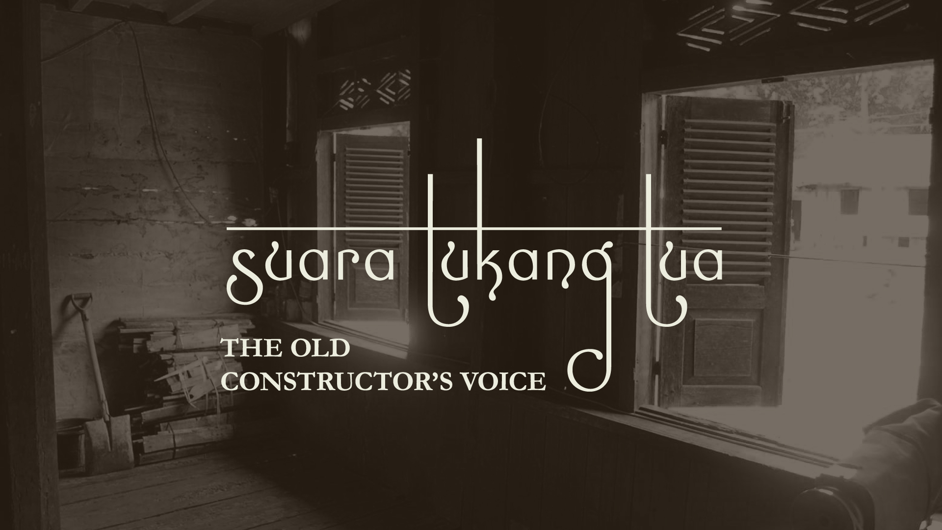
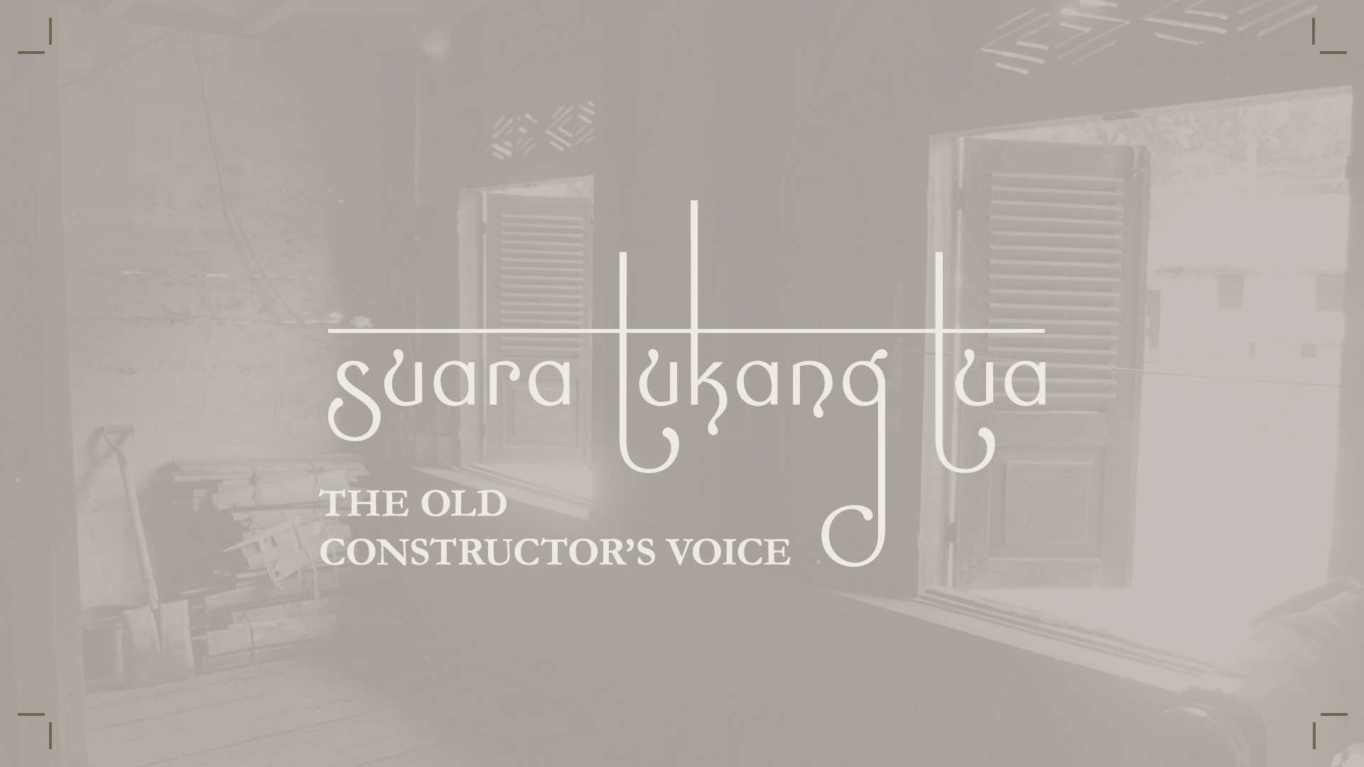
SUARA TUKANG TUA type design / brand identity / publication design
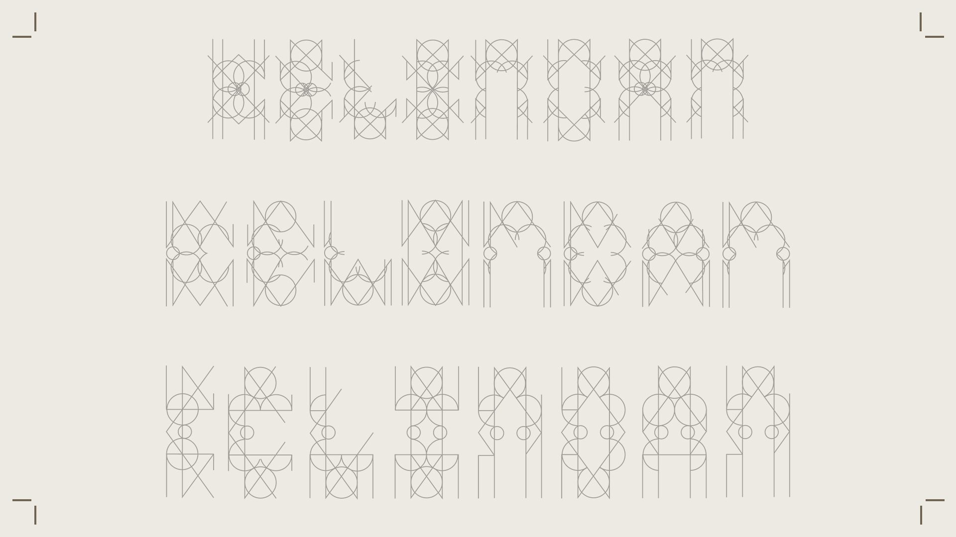
KELINDANtype design
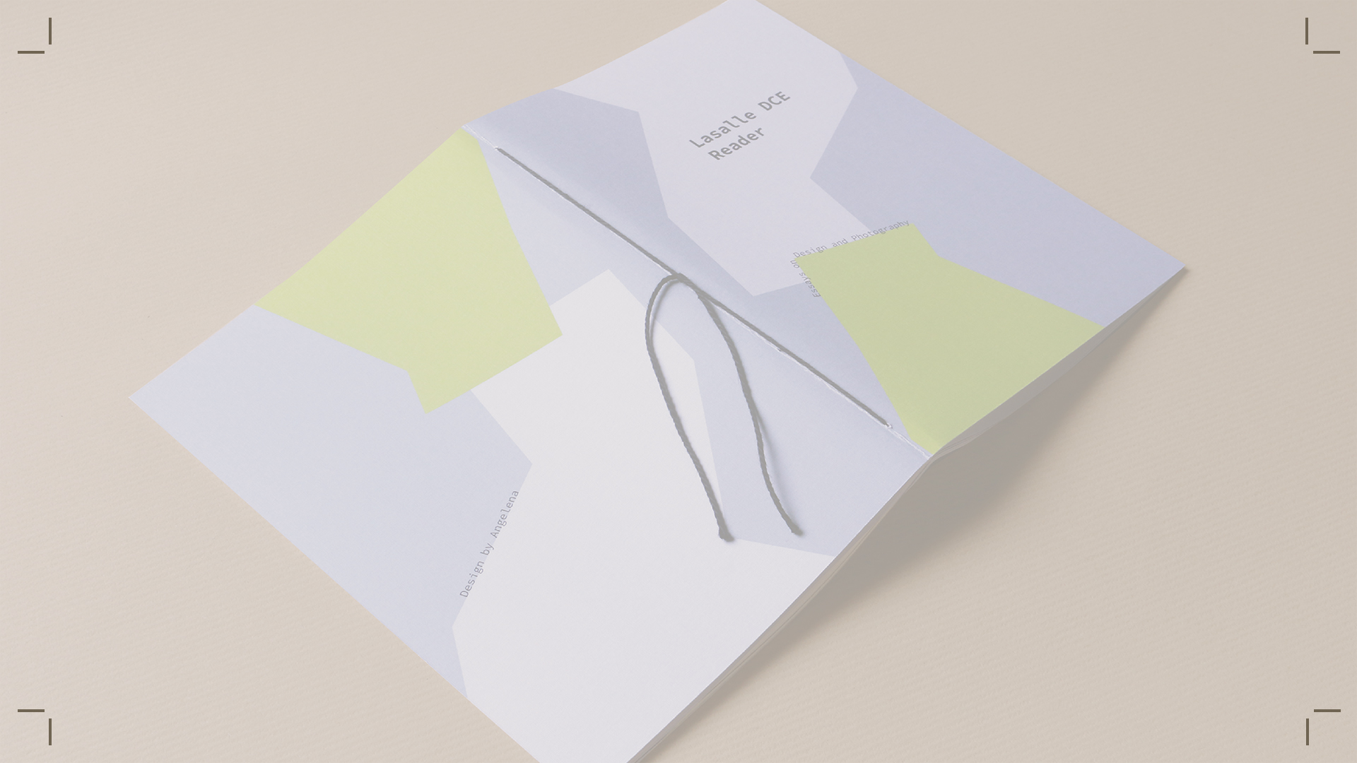
LASALLE DCE READERpublication design
PASANG SURUTimage-making

ARCHIFESTtype design / brand identity
with groupmate Sulaiman Baktiyar
DIRIKUlogo design /packaging design